The Label
03/03/09 16:51 Filed in: Wine
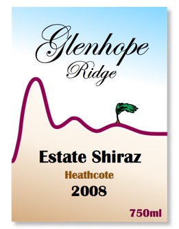
The label design says a little about us, and was inspired by a desire to show a sense of place. We’re located on a ridge just north of the McHarg Ranges in Glenhope East. And because of those ranges, it is always windy, with a good stiff breeze coming from the range, hence the image of the tree. And thanks to that wind, which is almost always present on mornings and evenings, the grapes are never as heat stressed as they are in other vineyards in the region.
And we have the two main colours, being the blue sky representing the sunny weather that is common in central Victoria and the reddish brown earth due to the abundance of iron stone and sandstone in the ground. Finally, there is the crimson ribbon (the colour of the wine) delineating the earth from the sky and of course a product of the two.
It is the iron in the ground in Heathcote that gives this region the dark purplish intense coloured wines it is renowned for.
blog comments powered by Disqus
